The third of the Basic Front End Development Projects that are part of the Free Code Camp curriculum asks you to build a JavaScript calculator. This is a progression from project 1, the Personal Portfolio Webpage, which was primarily focused on visual layout and design, and project 2, the Random Quote Machine, which added interactivity and a small bit of JavaScript. The calculator I built required a little bit of everything I’d used so far, plus a much heavier dose of JavaScript programming.
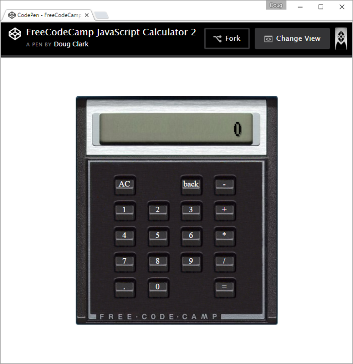
As you can see from the picture, I opted to try and make the calculator look realistic, including slicing up some images of an actual HP 15C calculator. Deciding on a look and feel wasn’t the first thing I worked on, but it was definitely one of the more time consuming parts of the effort. I’ll get into that a bit more below.
The first thing I worked on was getting the calculator functionality working. That required a display, a grid of clickable elements representing numbers, mathematical operations, and the like. The previous two projects were all about layout, and I used much of the same concepts in this project.
The display and buttons were initially just a bunch of
What sorts of “contexts” am I talking about? Consider clicking on a number button. If this is the first digit in the first number of the calculation, you’ll want to clear the initial zero from the display. If it’s not the first digit, you can just append it. But what if you had just clicked an operation button (e.g., +, -, etc.)? In that case, you’ll want to clear the current number from the display first. And so on.
There is a concept in computer science to deal with this situational behavior – a state machine. The basic idea is that you keep track of the current state of the machine (in this case, the calculator), perform the action that is appropriate for the current combination of input and state, and if necessary, change from the current state to a new one.
Getting my calculator to work properly became a process of determining what states I thought the calculator might be in, and deciding what actions should take place when you clicked on each type of button. My button types included: number buttons, operation buttons, the All Clear or AC button, the back button (which removed the right-most number from the display), and the equal button. I also worked out which items I needed to store in variables, which included the two numbers to be used in the calculations, the operation to perform, the result, and the current state. Finally, I created a list of the states, and what would happen in each state when you clicked on each type of button.
I’m not going to go into the details of state machines here, and the implementation used in my calculator is far from elegant, but I wanted you to have an idea of what my code is trying to do (if you decided to take a look.)
The one thing I missed in my initial state machine was what to do after the equal button had been pressed. The unique thing about this state was that the next key press could either lead to a whole new calculation being started, or to a new operation performed on the existing value. Adding this state and the corresponding logic to handle it completed my calculator functionality.
I was left with a calculator that worked, but looked like a bunch of rectangles you could click on. My initial thought was to simply round some of the corners and select a pleasing color scheme, but I was never good at pleasing color schemes, so I decided to try the “realistic” style.
I Googled “calculator image” and sifted through a huge number of images. I found several that would work, but the one that caught my eye was the HP already mentioned. I had used a super-expensive HP calculator in college, and loved the click of the buttons. I decided I would try to make the “button press” experience realistic, and started working on how to make that happen.
I started by cutting up the calculator image, and creating a button image that was free of text or symbols. I then edited the button so it looked like the button was pressed. This involved cutting off some of the bottom of the button, making the top of the button a little bit larger, and moving the whole thing down a little bit. It took a bit of fiddling, but I really liked how it ended up.
Once the images were created I thought I had done the bulk of the work, but getting them to look right in the browser was more difficult than I expected.
The primary challenge was that the text on the button had to move lower when the button was pressed. This didn’t seem like a big deal, as getting one button to work correctly was simply a matter of changing the line-height on the active event. Unfortunately, this didn’t work at all for a row of buttons, as the line height of the entire row was affected, throwing off the text on the other buttons.
The solution was to split the image from the text, and positioning the text absolutely. Instead of putting the image on the background of a
tags inside that div, and positioned that
tag absolutely. Here’s the HTML/CSS that moves the text lower:
.n-p { width: 50px; height: 35px; text-align: center; position: absolute; padding-top: 14px; padding-bottom: -15px; margin-left: 2px; top: -19px; left: -3px; ... } .n-p:active { top: -15px; }1
That’s a lot of specific pixel positioning code, and I’m not particularly proud of it, but the end result is that the text moves down about four pixels when you press it, which makes the buttons look like real buttons.
Another challenge was finding a font that looked realistic on a calculator. I first looked into 8-segment and 14-segment fonts, the sort of fonts that you see on old calculators, but had trouble finding the following combination of features: free, hosted, having a decimal character. I found several that matched two out of the three, but none that matched them all. Fortunately, Google had a terminal font called VT323, that ended up looking great.
The final polish bits were adding things like the back button and the decimal button. The decimal button was a bit tricky, as it is kinda like a number button, in that it contributes to numbers, but unlike other numbers, there can be only one. That was handled with this JavaScript:
if ($(this).text() == ".") {
  // special handling for adding a decimal point to the number
  if ($("#display").text().indexOf(".") == -1 ) {
    $("#display").append($(this).text());
  }
}
The indexOf() function returns the place in the string where the passed-in string starts, or a -1 if it isn’t found in the string. Thus, if it isn’t found, we append it to the end of the display. There was also some code that had to be added to get a zero to show up before the decimal when entering a new number.
This project took me more than a week of on-and-off focus. It was a good code-focused project that required some thinking and design in order to pull off (though I’m sure there are simpler implementations than the one I ended up with.)
Next up, the final Basic Front End Development Project – the Pomodoro Clock.

[…] required by the Free Code Camp curriculum in the Basic Front End Development section. The JavaScript calculator I built was by far the most complicated programming I’d done as part of Free Code Camp. Project #4, […]
LikeLike